NoBots
A mobile application designed to turn gamers into visible individuals.
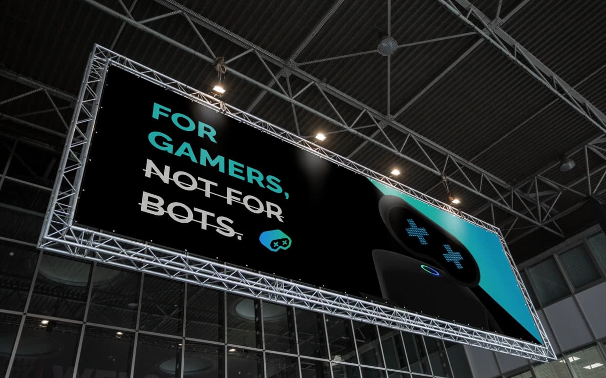
Gaming platforms talk about community but rarely about identity.
Most gaming apps focus on features : stats, matches, leaderboards, brackets, wins. While functional, these systems often flatten individuality.
Gamers become usernames. Skill becomes numbers. Presence becomes invisible.
Nobots identified gamers needed a way to present themselves, not just perform.
A platform for gamers, not bots.
The name Nobots became the organising principle of the brand.
It stood for real players, real effort, real expression.
Not automation. Not anonymous systems. Not faceless participation.
This idea informed everything from how the logo was constructed, to why a mascot existed at all.
Giving identity a face, Logo as meaning.
The Nobots logo is intentionally symbolic.
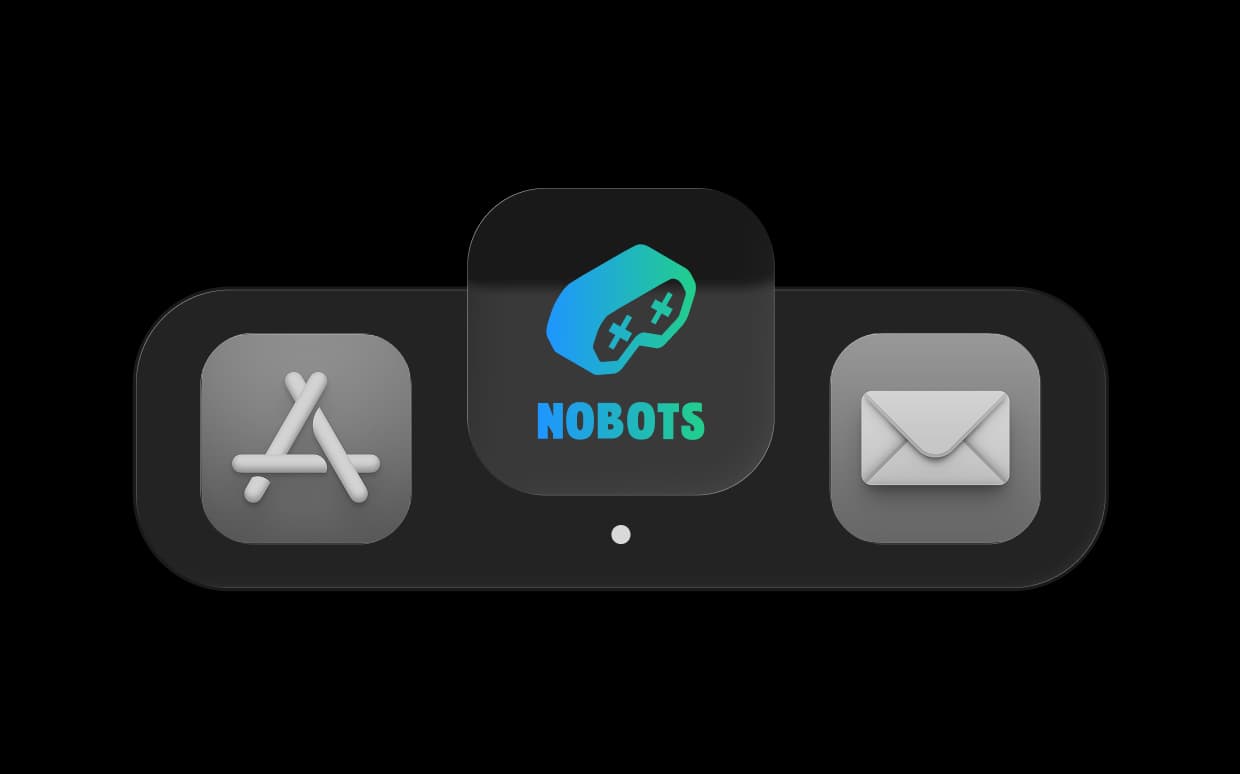
Its form draws inspiration from a gaming console, while simultaneously reading as a bot’s face. The crossed “X X” eyes signify a dead bot — a visual shorthand for the brand’s core belief. this is not a space for bots. It’s a space for people behind the controller.
The mark is bold, legible, and culturally native to gaming — designed to work at app-icon scale as well as across digital touchpoints.
the logo establishes meaning, the mascot brings the brand to life.
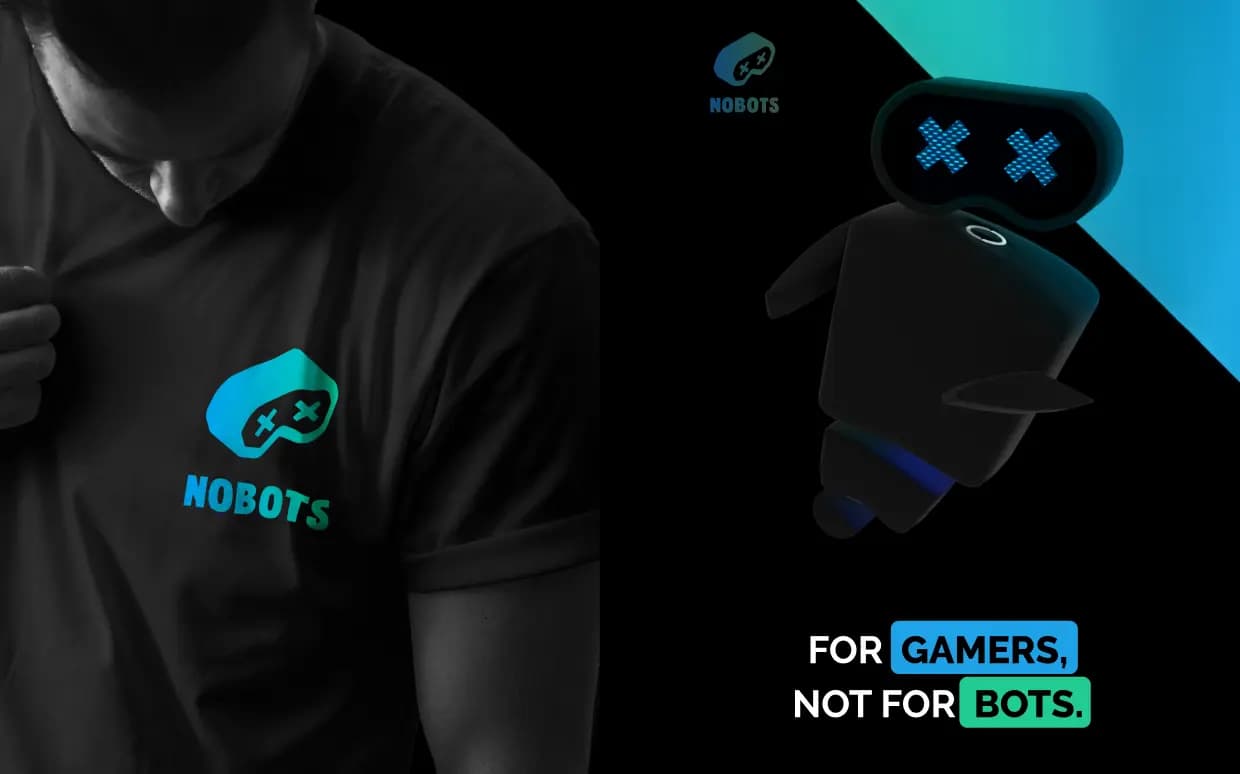
A brand that made gamers visible.
Nobots launched with a clear, recognisable identity in a crowded gaming space. The brand didn’t rely on aggression or gimmicks. Instead, it built trust through clarity, character, and consistency.
By focusing on identity first, the platform created room for gamers to show up as individuals not just participants in a system.

Brand Strategy
Brand Identity
Communication & Editorial
Rebranding & Refresh
Design Systems
UX/UI & Websites
Campaigns & Social