Cosko
The brand that unified a doorstep repair ecosystem
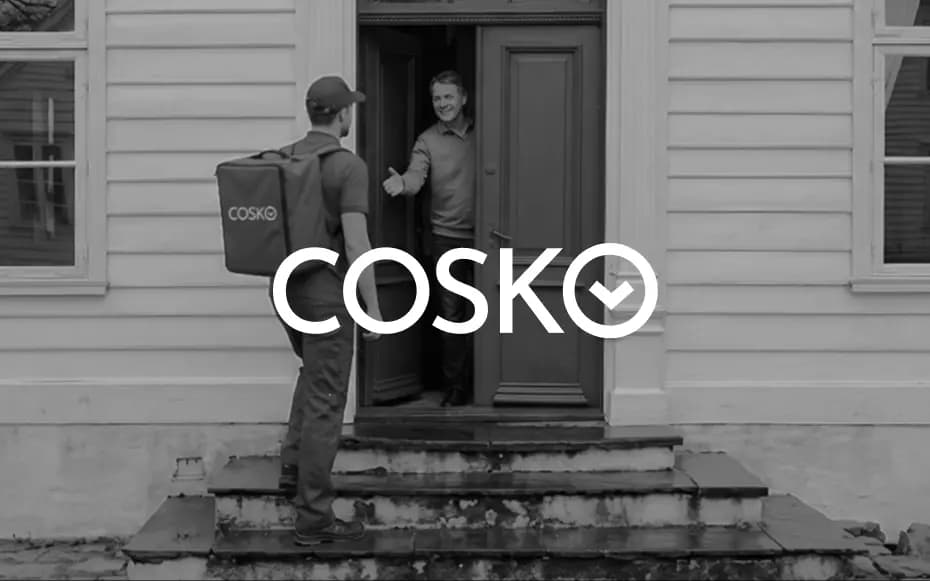
When a company has multiple service brands, growth starts to create friction.
For customers, it becomes confusing: different names, different promises, different experiences for what is essentially the same problem getting things repaired quickly and reliably.
For technicians and shop owners, it becomes fragmented: different flows, different rules, and inconsistent lead systems.
Cosko needed to become the one brand that made everything feel simpler without feeling generic.
A multi-service hub for repair and renewal.
Cosko’s brand idea was built around one clear behavior: 'select your service' and get moving.
The identity needed to communicate that Cosko isn’t a single repair service it’s a platform that hosts multiple categories within one system.


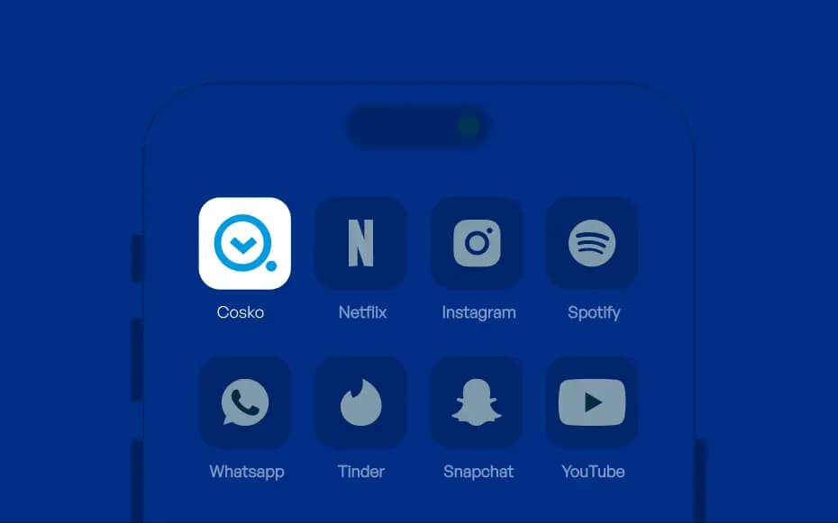
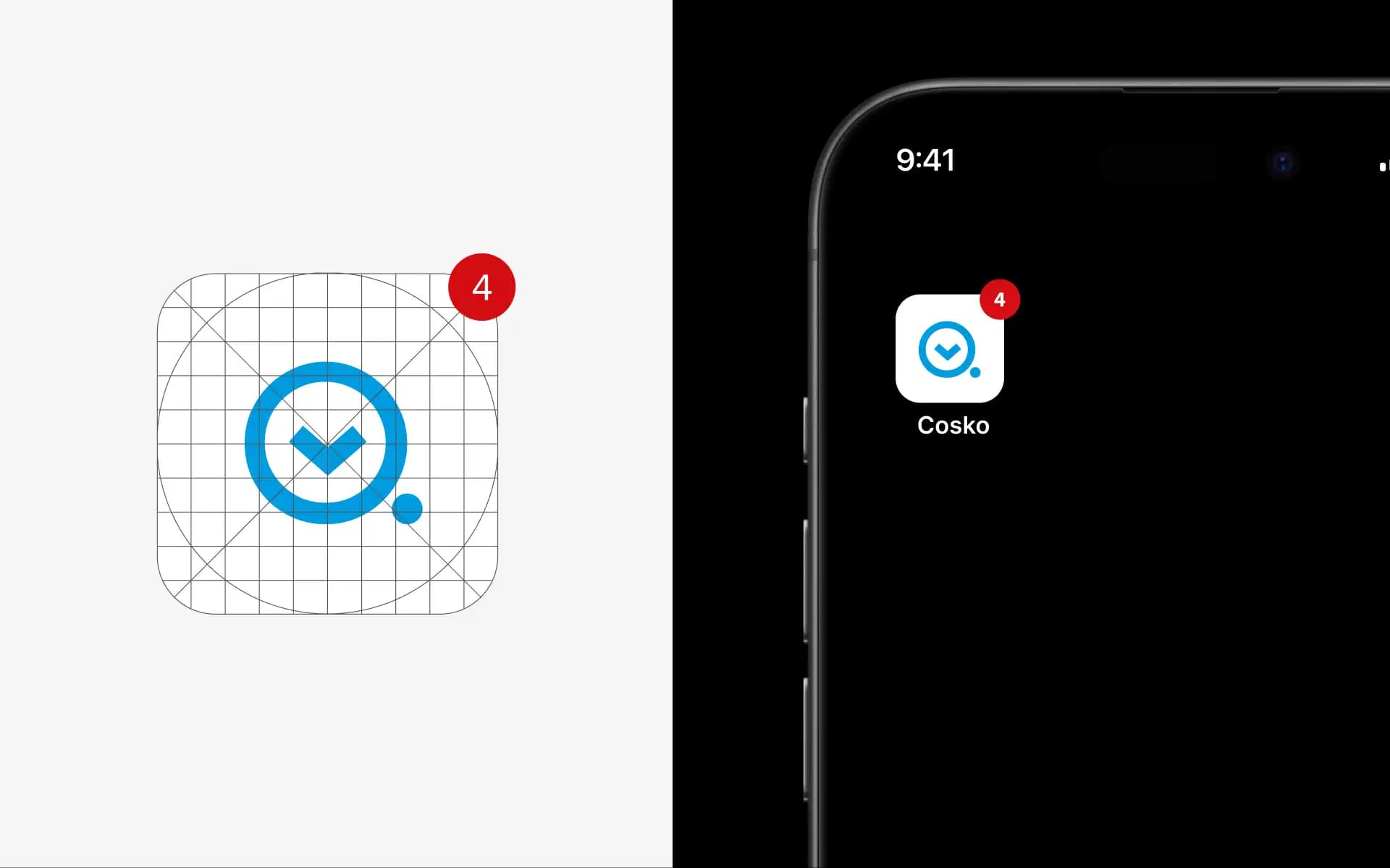
A symbol designed like a product interaction.
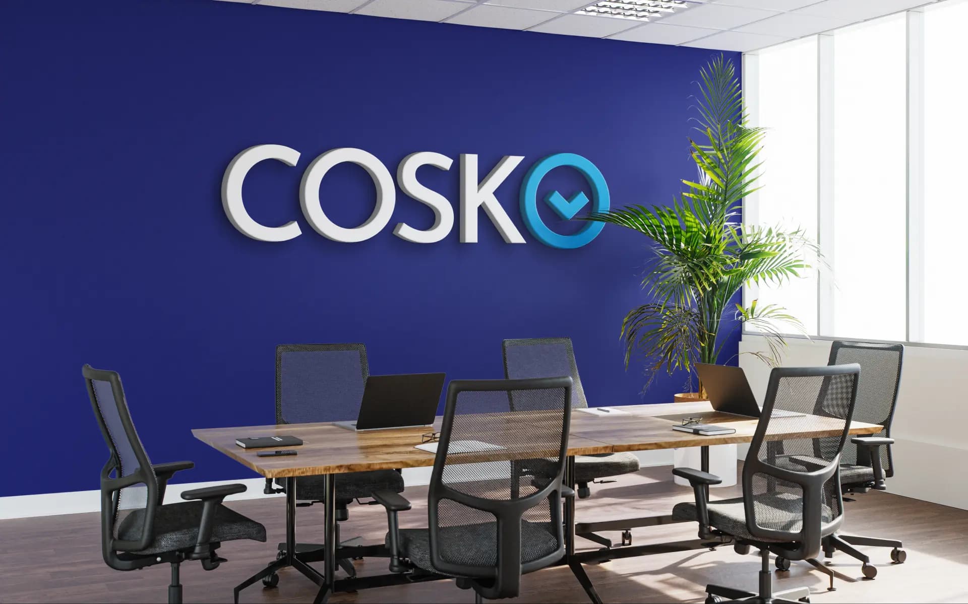
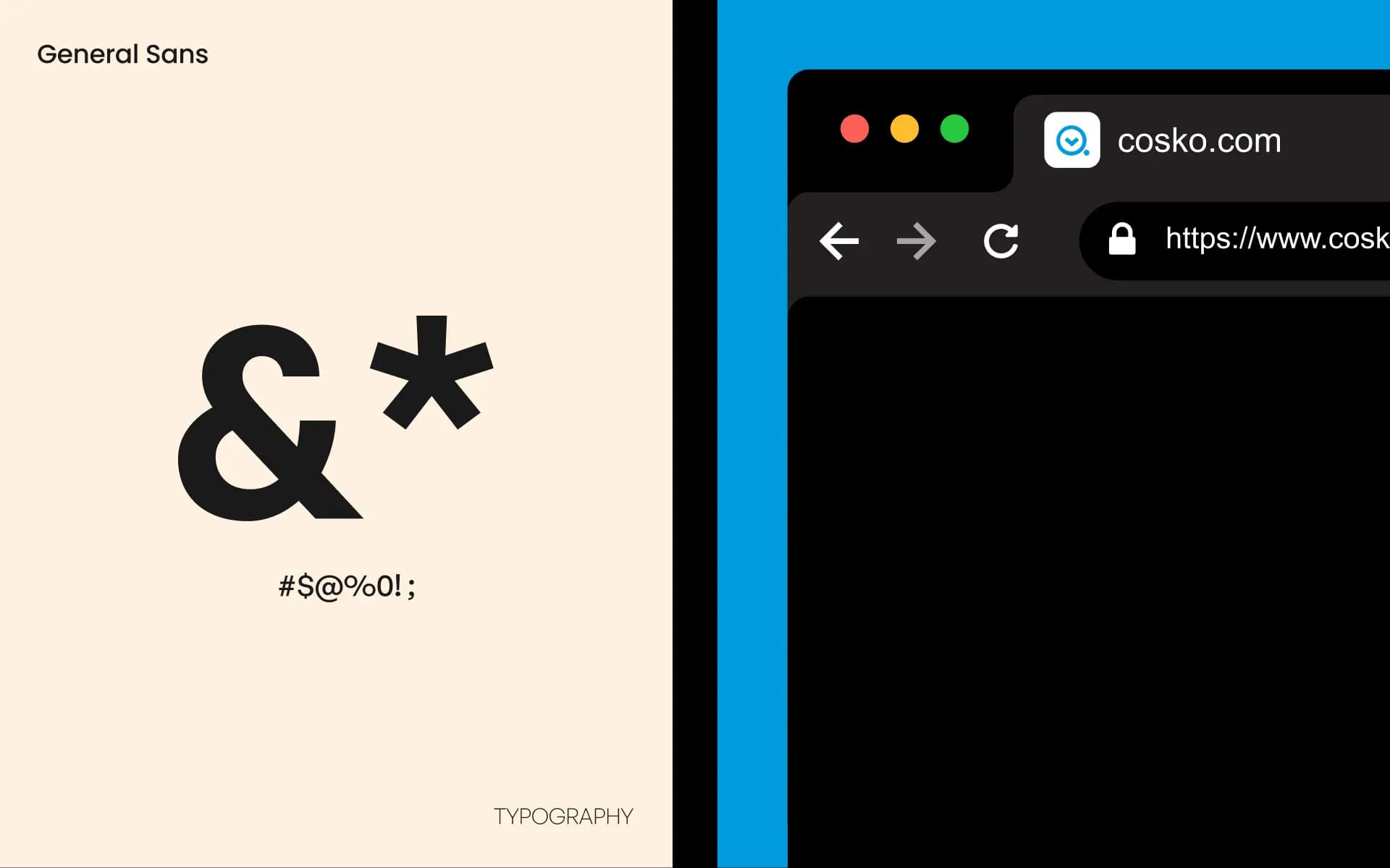
The logo was built around a geometric “O” that contains a precise downward arrow—an 'arrow-in-O' motif that acts as a compact badge and a visual shorthand for choosing a service inside a one-stop platform.
The arrow adds motion and signals speed and reliability, while the wordmark stays clean and modern to keep the system scalable across new categories and touchpoints.
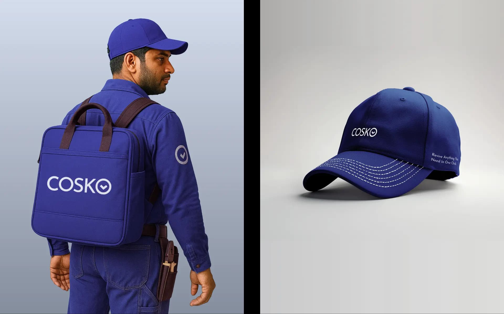
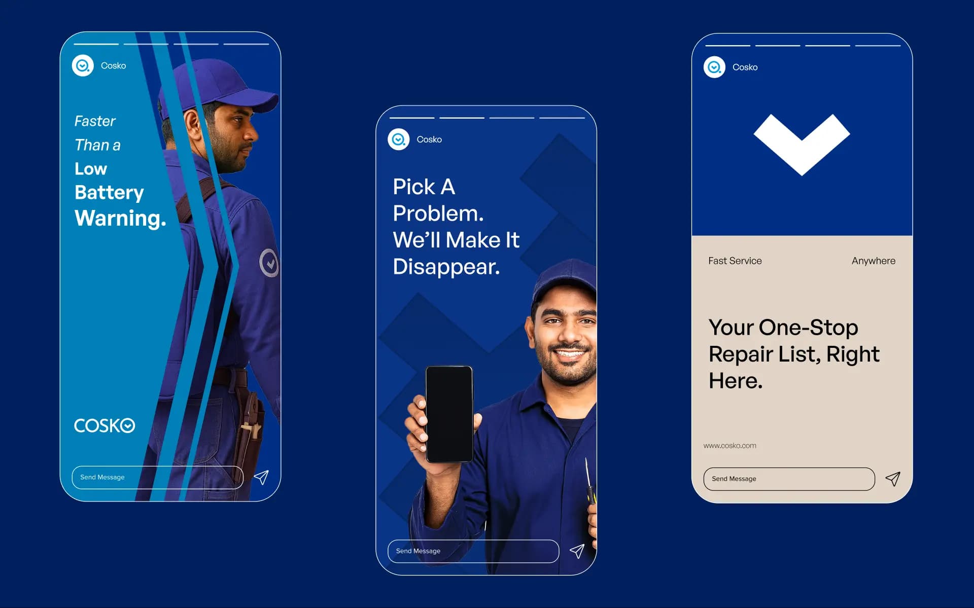
A single brand that made a multi-brand business feel like one coherent product.
Cosko became the 'torch bearer' identity, the one name customers remember, the one platform partners choose, and the one system the business can scale across services without rebuilding trust.

Brand Strategy
Brand Identity
Communication & Editorial
Rebranding & Refresh
Design Systems
UX/UI & Websites
Campaigns & Social