RepairSeva
A doorstep repair service built around reliability, not promises.
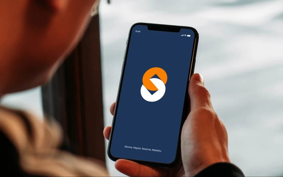
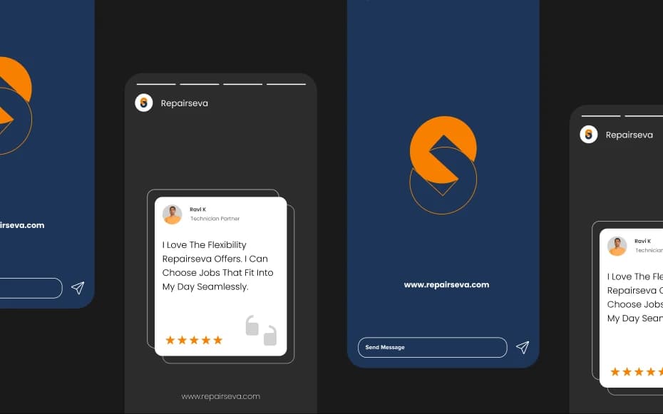
When devices fail, stress kicks in immediately.
For users, device repair is rarely planned. Screens crack, batteries fail, charging ports stop working and suddenly daily life is interrupted.
The repair industry is crowded, but fragmented. Customers worry about: Is this technician genuine? Are the parts original? Will the repair last? Am I being overcharged?
RepairSeva needed to answer these questions before a technician ever reached the doorstep.
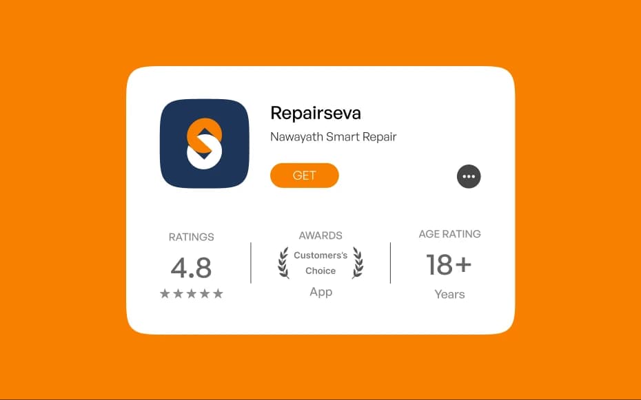
Service you can trust, at your doorstep.
The brand idea was rooted in reassurance. RepairSeva isn’t just about fixing devices. It’s about removing doubt from the process.
The identity had to feel: professional, not local-shop casual, friendly, not corporate, dependable, not flashy.
Every visual and interaction needed to reinforce one feeling: you're in safe hands.

Trust, built into the brand. Logo as meaning.
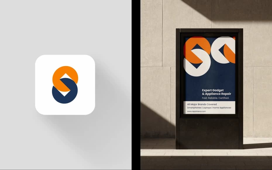
The RepairSeva logo is constructed using spanner heads a universal symbol of repair and expertise. Arranged in a linked, chain-like form, the mark reflects the idea of 'Seva' (service): connection, continuity, and support.
It’s a subtle metaphor: each link represents the relationship between the user, the technician, and the service itself.
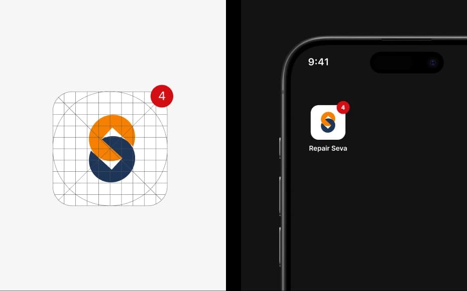

A brand that reduces anxiety in moments that matter.
RepairSeva launched with an identity that matched its service promise.
Clear, calm, and dependable, the brand helps users feel comfortable inviting a technician into their personal space a critical trust barrier in doorstep services.
By focusing on reassurance rather than exaggeration, RepairSeva positioned itself as a reliable everyday service, not just an emergency fix.

Brand Strategy
Brand Identity
Communication & Editorial
Rebranding & Refresh
Design Systems
UX/UI & Websites
Campaigns & Social